About this project
As our product continued to grow in both the number of clients and features, it became increasingly important to maintain a consistent style and visual language across all areas. It was clear that we needed a more systematic way for our product to scale and for each team to work efficiently.
The goal was to establish a collection of reusable components, that can be combined together to create both simple and complex experiences, as needed.
The problem
At this point in time, the interface was still using components designed by developers and the pipeline was packed with new features.
Research & Interviews
I sat down with the FE and BE teams and learned they were struggling with being able to reuse components due to the inconsistent layouts. After discussing the strategy on how to scale the product, we decided having a modular system would save crucial development time in the long run and provide flexibility at the same time.
I looked into similar services, such as UserTesting, Hotjar, and Survey Monkey to research various solutions we could leverage from.
Ideating & Sketching
I sketched out ways in which we could use modules to accommodate our various needs.
How would it look when we needed to upload media? Add/remove/edit survey questions? Customize panel settings? Can these components be used on the dashboard, experiment design, and results pages? Etc.
I also reviewed the impact on upcoming projects.
Prototyping & Testing
Guerilla tests were performed using LoFi mocks created in Sketch and uploaded into Invision. The purpose was to validate the intuitiveness of the user flow.
Was the progression natural? Do users know how to expand/collapse modules? Is the information hierarchy and font clear?
I learned that it was not easy to differentiate the modules when they were collapsed. We corrected this by adding visuals and more details.
Review & Iterate
I collected my findings from the user tests and proposed larger changes to the development teams. It was important that we were aligned to ensure there would be no technical blockers and that they felt involved.
We held our meetings over google hangouts, since they were located in Serbia and Brazil, and communicated on a daily basis via Slack and Invision’s commenting feature.
The final design
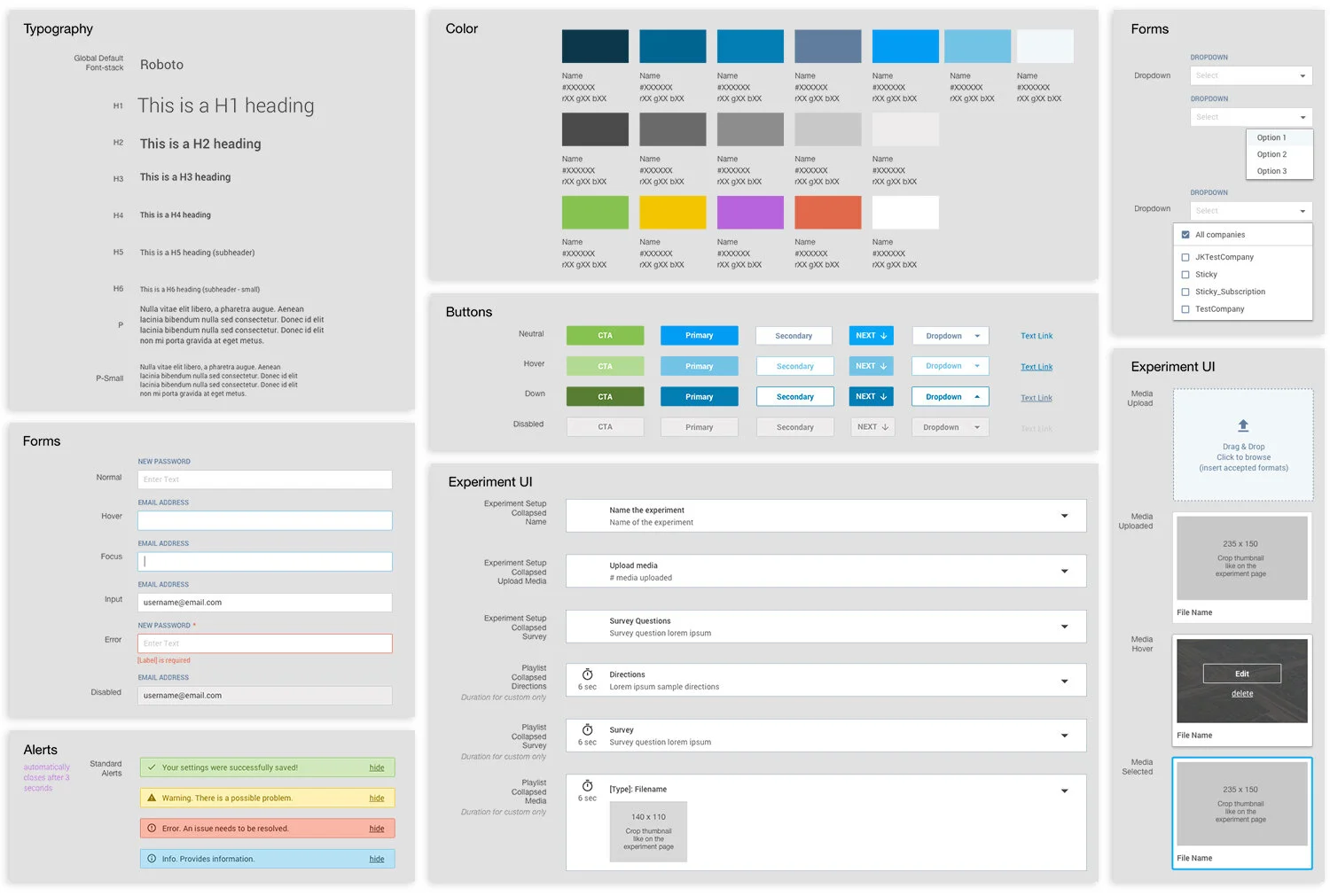
The solution we moved forward with was strongly influenced by Google Material Design and the principles of Atomic Design.
Examples taken from the pattern library
Main takeaways
Having a strong foundation is essential and establishing a design system is beneficial for all teams and increases efficiency. Less time is spent trying to figure out small details and setting more time to solve bigger problems.
Sometimes it’s okay to be “good enough”. In the fast pace startup environment, it’s okay to cut certain corners to save time. For example, even though I wanted to design all our icons I ultimately decided to use Google Material Icons. This enabled me to allot more time user testing and solve bigger problems.


